
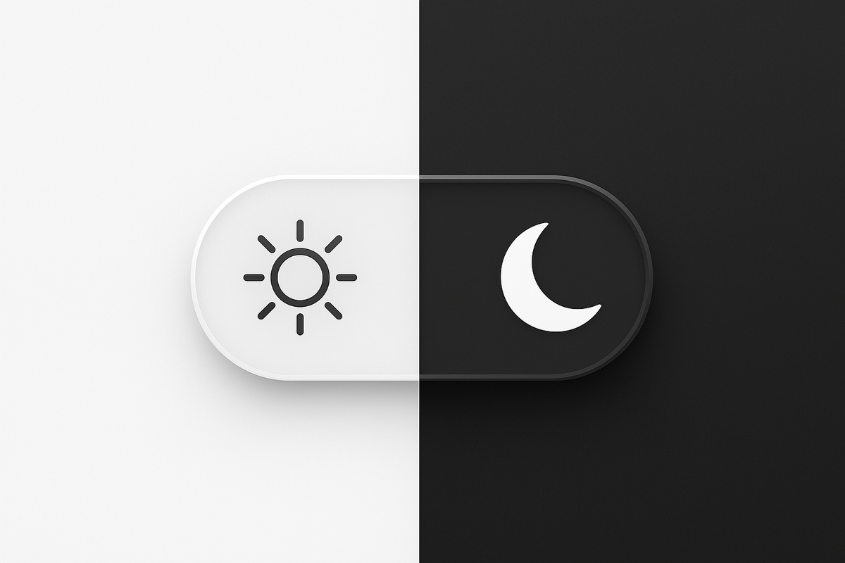
1: Dark mode: The switch
Alright, so why the switch?
If you’ve ever flipped on dark mode, you know the change: the bright white screen dims to black or deep gray, and your eyes instantly relax. But why has this simple and elegant toggle become a default feature on phones, apps, and websites? The answer is about more than style. It’s rooted in comfort, health, and user experience.
Why dark mode matters
To get straight to the point. Bright, white backgrounds create a strong contrast that can cause eye strain, especially in low-light environments. When your pupils contract under intense light, it leads to visual fatigue and discomfort during long screen use. A study published in 2018 found that reducing screen luminance lowers visual fatigue and improves comfort when reading on screens in dim lighting.

Digital Eye Strain- A Comprehensive Review
In practice, by replacing white backgrounds with dark grays or black, dark mode reduces overall light output and lessens the contrast between text and background, allowing your eyes to adjust more comfortably. Perfect for long tasks behind a screen. Or you know, for us normal people who enjoy a more premium visual experience.
Mood and focus: Beyond comfort
Many users describe dark mode as calmer and less visually intrusive, especially in evening or night conditions. The softer, muted palette helps reduce cognitive load, letting the eye rest on the content itself rather than fighting against bright backgrounds.
From a design perspective, dark mode carries a certain prestige. In visual language, darkness often signals luxury and mystery. You only need to glance at the perfume or high-end product industry to see this in action: sleek black packaging, minimal logos, and subtle shapes designed to evoke intrigue while leaving room for interpretation.
Applied to digital interfaces, this aesthetic can make a product feel exclusive and intentional. Offering users a custom dark experience isn’t just a stylistic choice. It can enhance clarity, focus, and emotional engagement, all while delivering a sense of sophistication that lighter designs often lack.
Drawbacks of Dark mode
"THERE ARE NON"
Well okey. Let's play devil's advocate on this passionate subject of mine.
Dark mode isn’t ideal in all situations. In bright daylight, dark backgrounds can reduce readability and create visual barriers. Poorly implemented dark themes can also create accessibility issues, as muted colors make some content harder to read. That means making everything dark is not a preferred method or a good choice.
There’s also the “visual cave effect”: if you spend most of your day in dark interfaces, bright environments feel harsh when you look away. In a work environment, offices tend to lean to the right side, making the contrast noticeable and off-putting to most people. This is why we dark mode users can be found in the home office!
TL:DR
Dark mode is a valuable tool for comfort and focus, particularly in low-light settings. Switching between dark and light modes depending on your environment will give the best overall experience. Or continue as always and be stubborn to your preferences, denying underlying facts (that's what I do).