3: Dark mode: Under the hood

We’ve covered how dark mode feels and the perks it offers. Now let’s look at the technical side, performance, SEO, and implementation. What's hiding under the hood?
What is Native Dark Mode?
From what I gathered. The most efficient way to deliver dark mode is through native support, where the website or application is designed to respond directly to the user’s system preference. This is typically implemented with CSS media queries such as prefers-color-scheme. As documented by MDN Web Docs.
With this approach, the browser itself handles the theme switch automatically. Because it’s built into the rendering process, there’s no extra scripting layer or color manipulation required after the page loads. Resulting in near-zero performance overhead.
Native dark mode vs extensions
In contrast, browser extensions like Dark Reader simulate dark mode by dynamically altering the page’s colors after it loads. This is done by inverting colors or applying filters. From what I've seen in user feedback forums, this process can be computationally expensive. More noticeable on "image-heavy" or "script-intensive" sites where there are a lot of things going on.
If performance, battery life, and visual consistency are priorities, native dark mode is almost always the better choice. Extensions still have their place for forcing dark mode on sites without built-in support, but they come with trade-offs in speed and sometimes visual accuracy
Search and dark mode
Just based on my Dark mode itself doesn’t directly affect search rankings. Search engines don’t give higher priority to sites based on color schemes. However, providing a better user experience—like longer visits and lower bounce rates—can indirectly support SEO goals. If users find your site more comfortable to read, they’re more likely to stay engaged.
Best practices tips for dark mode Implementation
To end the section, I want to provide some concrete tips and tricks on how to successfully implement dark mode. To each section in my list, I'll add some links for more in-depth reading. This is not a place for technical unraveling.
- 1. Match preferences automatically. Leverage so your site or app detects whether a user prefers light or dark mode. Thiprefers-color-schemes ensures the theme switches seamlessly without any extra clicks, providing a smoother, more personalized experience. There is always the ability to provide auto functionalities usually found on screens that have a "night cycle."

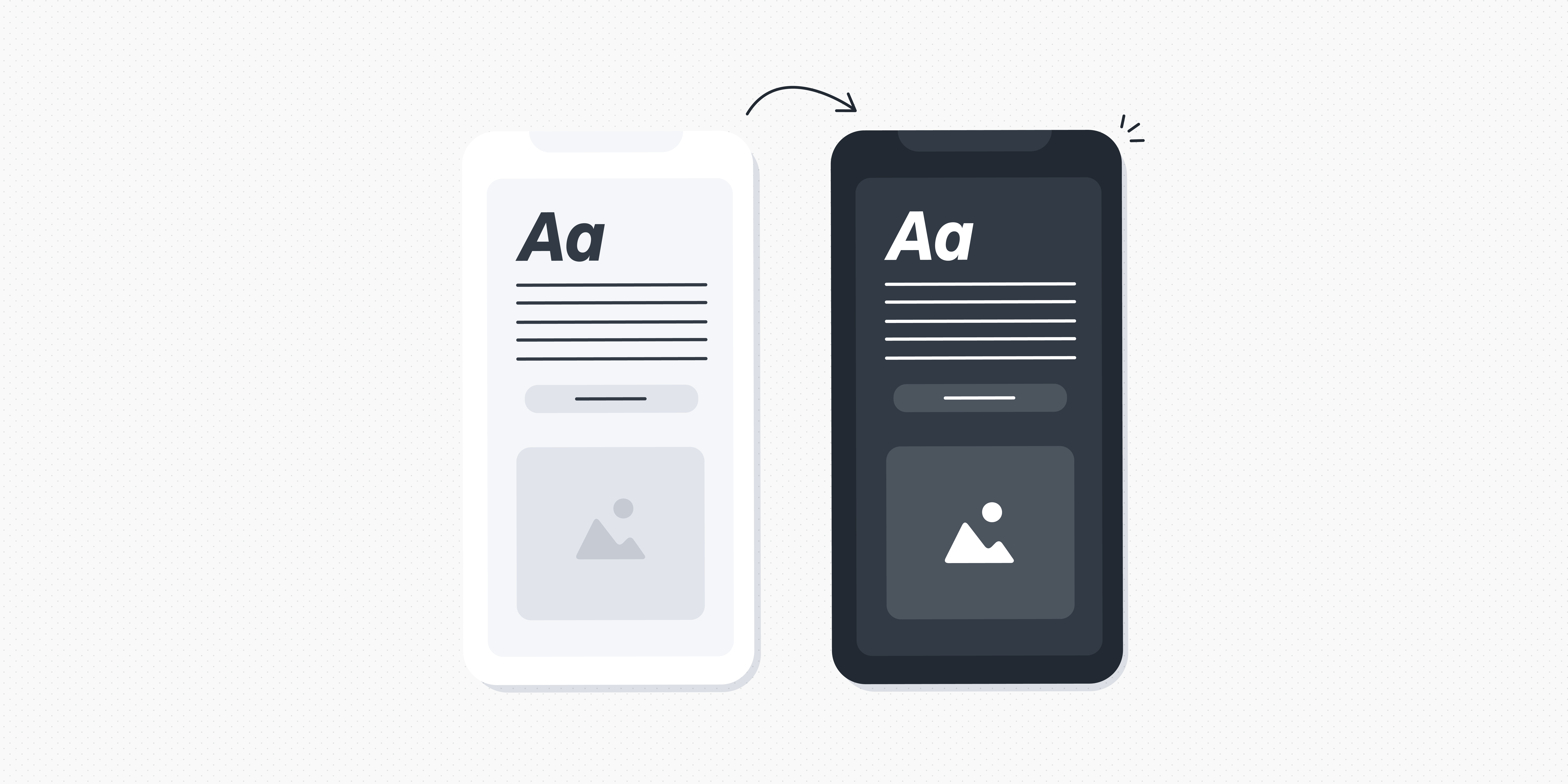
- 2. Optimize for both themes. Make sure images, icons, and text are visible in both light and dark modes. For example, avoid using gray text on a dark background without sufficient contrast. Remember, dark icons will disappear in dark mode. Balanced visuals maintain readability and prevent eye strain.

- 3. Minimize Heavy Scripts Dark mode should enhance performance, not hinder it. Avoid complex scripts that dynamically invert colors or apply filters after the page loads. These can slow rendering and increase battery usage, killing your users' devices. Native implementations seem more efficient and responsive.

- 4. Test Across Devices and Lighting Conditions. Screens vary widely. Some are OLED, some LCD, and the ambient light changes constantly. Test dark mode in multiple environments to ensure color, contrasts, and layouts remain comfortable and accessible everywhere.

- 5. Consider User Control. Even with automatic detection, offering a manual toggle gives users the freedom to override system preferences. A simple switch can make your interface feel more flexible and user-friendly.

In conclusion,
Dark mode has grown from a beloved novelty into a practical feature that improves comfort, conserves battery, and enhances the user experience. On top of that, with the right implementation (and my subjective opinion), it looks way better and provides a premium feeling to your user experience.
Implement it thoughtfully, and it can serve both your users and your site’s performance without compromise.
What's stopping you from joining the dark side of design?


